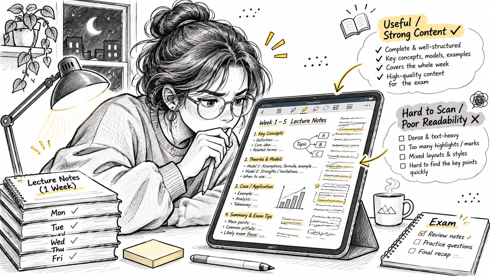
You've got a week of lecture notes on your iPad, a stylus that works, and a page that takes you four seconds to find the section you need. The content is good. The page is fighting you anyway.
That fight is almost always typography. The font you picked when you set up your notes app months ago is now the lens every idea has to pass through, and a lens that makes you squint slows down everything that comes after it. Choosing fonts for notes is a reading decision first and a style decision a distant second.
Table of Contents
- Why the Font in Your Notes Matters More Than You Think
- Readability Factors That Matter More Than Style
- Which Font to Use for Each Kind of Note
- Why Specialty Fonts Do Not Automatically Help
- When Handwriting Still Beats Typed Notes
- Test Your Font and Lock In One System
Why the Font in Your Notes Matters More Than You Think
Open last week's notes and watch your eyes work. You're hunting one definition inside a dense paragraph, and the page either lets your eye slide down to it or makes you read line by line until you find it. Same information. Different effort.
Every note you take is read through its font, which makes the typeface the lens on the glasses you wear for a two-hour revision session. A well-chosen one turns the page into something you can skim. A poor one adds a small tax to every line you read. Pay that tax across a semester and it shows up as fatigue rather than a dramatic failure, so few people ever notice it's happening.
Font choice changes attention, not memory. A 2024 study published in Cureus put 30 participants into three font groups and measured attention with a letter-cancellation task and working memory with an N-back task. Completion times differed significantly between the groups at p < 0.05, with participants fastest on serif fonts, and Times New Roman produced particularly strong attention results. The working-memory result went the other way: no statistically significant difference at p > 0.05. Fonts changed how quickly people scanned and attended, but didn't reliably change what they held in their heads.
That's the useful boundary. Typography is a scanning and attention tool, not a comprehension pill. It can make review faster and less tiring. It can't make you remember something you never understood.
And there's no universal winner. A 2022 ACM study of 352 adults aged 18 to 71 reading on their own devices found reading speed rose by 35% when comparing each person's fastest font against their slowest, without any drop in comprehension. Two students reading identical pages can be doing very different amounts of visual work.
Three things follow: which typefaces suit each kind of note, which readability factors matter more than style, and how to test fonts on an iPad in about five minutes. The target is notes you can read fast and recall easily. Notes that impress someone leaning over your shoulder are a different project.
Readability Factors That Matter More Than Style
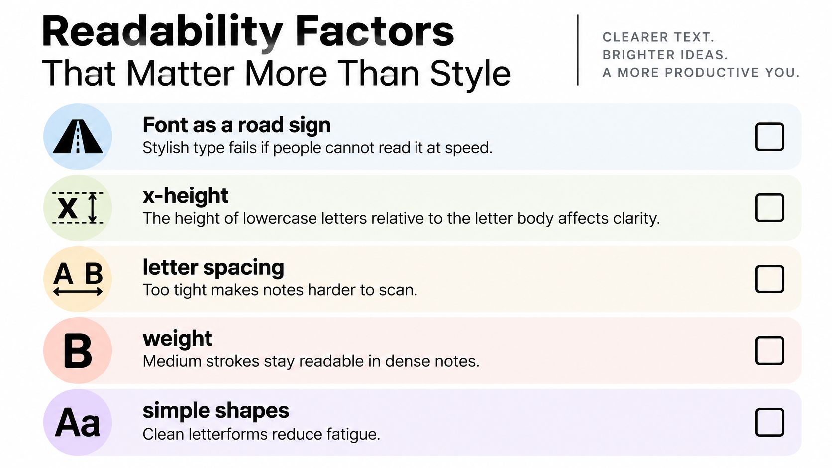
A road sign can be beautiful and still fail. If drivers can't read it at speed, the design is a liability and nobody blames the driver. Your notes are read at speed too, especially the night before an exam, when you're skimming for the one line you half-remember.
What decides whether a page scans or fights back.
X-height decides how big a font looks
X-height is the height of the lowercase letters relative to the font's nominal size. Two fonts set to 16 pt can look wildly different because one has tall lowercase bodies and the other has short ones surrounded by white space. Readability Consortium research found larger print size significantly improves reading speed overall, and when increasing size isn't practical, fonts with larger x-heights can provide a marginal speed advantage. The check is simple: type the word "exam" in each candidate and look at it from the distance you hold the iPad. Your eye answers in two seconds.
Size has to match the screen
A size that works on a phone is a guess on a tablet. In a study of 33 participants testing three display sizes and five font sizes, the shortest reading time on small and medium displays came at a 2.4-millimeter font size, with 2.6 millimeters the slowest. On large displays the ranking flipped, and 2.6 millimeters was fastest while 2.2 millimeters was slowest. Set size on the device you'll study from, at the angle you'll hold it.
Weight, spacing and contrast
- Weight: thin strokes and hairline serifs wash out at small sizes and low contrast. Medium weights hold up in dense notes.
- Letter spacing: tight counters close up and letters merge. A little breathing room between characters costs you nothing in length and buys a lot in scanning speed.
- Contrast: dark mode is only kind to you if the text isn't a mid-grey on black. Strained contrast is the most common cause of "my eyes hurt after 40 minutes."
- Simple shapes: ornamental joins and script-style letterforms are the first thing to break down when text gets small.
If you want to watch how much letterform and spacing change before you touch your settings, this walkthrough is worth ten minutes.
The five-point check: an x-height you can see at arm's length, a size matched to the screen, medium stroke weight, spacing that doesn't crowd, and contrast you can read in your usual lighting.
The best setting is the one you scan without noticing you're scanning. That's easier when font family and font size are separate controls, because you can compensate for a low x-height by nudging size up instead of abandoning a typeface you like. The same logic applies to taking clearer meeting notes, where you're scanning for decisions while the conversation keeps moving.
Which Font to Use for Each Kind of Note
A font is a tool, and each note type has a job. A formula page and a diagram page need different things from you, and one typeface rarely does both well.
| Note type | Font style | Starting size | Why it works |
|---|---|---|---|
| Lecture summaries | Humanist sans-serif | 16-18 pt | Open letterforms stay clear during fast review |
| Formulas and equations | Neutral sans-serif or math-friendly serif | 16-18 pt | Clean symbols and even spacing keep notation distinct |
| Headings and section titles | Serif or bold display | 20-24 pt | Contrast with body text marks the hierarchy |
| Long revision pages | High x-height sans-serif | 18-20 pt | Larger lowercase letters reduce scanning effort |
| Glossaries and definitions | Serif (test against sans-serif) | 16 pt, then adjust | Test on the same passage to see which reads faster for you |
| Diagram labels | Sans-serif or simple handwriting style | 11-12 pt | Short labels only, since decorative joins fail at small sizes |
Those sizes are starting points on a tablet, not rules. Push each one up or down until the lowercase letters feel comfortable at your normal viewing distance.
The three rows worth understanding
Lecture summaries carry the most words and get read at the highest speed, which is why a humanist sans-serif earns the default slot. Open apertures on letters like c, e and s keep words from smudging together when your eye is moving quickly.
Headings exist to break the page into chunks your eye can scan. The specific font matters less than the contrast: a serif heading over a sans-serif body, or a heavier weight at a larger size, tells your brain "new section" before you've read a word. Keep the gap between heading and body obvious.
Diagram labels are short and live at small sizes, which rules out anything with flourish. A simple handwriting style works here precisely because labels are two or three words, not paragraphs.
Serif or sans-serif is the wrong question
A 2026 study comparing Verdana with Times New Roman found no statistically significant differences in cognitive load, reading time, or comprehension, and the effect sizes were small or negligible. Some analyses did report a readability and speed advantage for Verdana, but the broader results didn't establish font type as a reliably superior choice. Practical translation: the test is whether you can read the page comfortably, not whether the font belongs to a famous family or a fashionable category.
A structure worth stealing: fix one body font for most of your notes, then add a second font only for headings. Two fonts, consistently applied, beat six fonts chosen per page. Tinymoose's note taking format guide shows how that hierarchy looks when it's working.
Why Specialty Fonts Do Not Automatically Help
Two beliefs show up whenever fonts and notes get discussed. A handwriting-style font makes notes feel personal and therefore more memorable. A dyslexia-friendly font makes reading easier for anyone who struggles with print. Both sound reasonable. Neither survives contact with the evidence intact.
A 2017 study in Annals of Dyslexia tested 170 children with dyslexia and found they read text set in Dyslexie no faster or more accurately than the same text in Arial. Reading times and error counts were comparable, and participants generally preferred Arial. The branded font didn't fail because it was badly made. It failed because letterform novelty isn't where reading difficulty lives.
That finding repeats. A separate study of children with and without dyslexia found no measurable improvement from a modified letterform or from changing inter-letter and inter-word spacing. The readers with dyslexia did read more slowly overall, averaging 2.91 syllables per second against 4.49 for the control group, roughly 35% lower, but the dyslexia-friendly design delivered no significant reading-speed or accuracy advantage.
Read those two results carefully and the lesson isn't "specialist fonts are worthless." It's narrower and more useful: a font with a good story attached to it is not a guarantee of anything.
The practical rule: keep handwriting-style fonts for titles, dividers and short diagram labels. Put the body text of anything you'll actually study in a plain, adjustable font, and spend your effort on size and spacing instead.
What moves the needle for a struggling reader is duller than a font brand: clear wording, text you can enlarge without breaking the layout, spacing you can loosen, and a page with fewer competing elements. Those are controls, not typefaces, which is why a flexible settings panel does more for accessibility than any single font choice.
Individual readers differ enough that the last word belongs to a test, not a recommendation. The font that helps is the one you've confirmed on your own material.
When Handwriting Still Beats Typed Notes
Applying a handwriting font to typed notes feels like it should carry the benefits of writing by hand. It doesn't, because the research measures the act of writing, not the appearance of the finished page.
A 2024 meta-analysis covering 24 studies across 21 articles found handwritten note-taking and review produced higher college achievement than typed notes, with a small positive effect size (Hedges' g = 0.248). Typing, meanwhile, produced substantially greater note volume (Hedges' g = 0.919). The advantage of handwriting is the summarizing your brain does while your hand moves. A script font on a keyboard-typed page skips that work entirely.
Typing still wins on speed, editing, searching and legibility, so the honest conclusion isn't "handwriting beats typing." It's that the two formats do different jobs.
| Task | Better format | Why |
|---|---|---|
| Key concepts during a lecture | Handwritten | Forces you to summarize rather than copy |
| Diagrams and sketches | Handwritten | Spatial layout is faster to draw than to build in typed text |
| Mathematical working | Handwritten | Symbols and steps stay in view as you work |
| Searchable summaries after class | Typed | Easy to search, edit and reorder |
| Technical vocabulary and definitions | Typed | Easy to copy, check and link |
| Action lists and deadlines | Typed | Easy to scan and tick off |
| Revision review | Both | Compare the typed summary against handwritten sketches to test recall |
The hybrid that actually works
Write concepts, diagrams and working by hand during class, then type a searchable summary and an action list afterwards. You keep the encoding benefit of writing and gain the retrieval benefit of a plain, readable, searchable page. Before you commit to an app for the typed half, this Goodnotes note-taking app breakdown walks through how the mainstream option handles the workflow in practice.
If you're moving handwriting into text, handwriting recognition apps for iPad are worth understanding before you trust them with a semester.
Conversion is good, not perfect
Handwriting recognition has improved dramatically and still isn't transcription. A survey of handwritten-text-recognition research reports that early systems recorded character error rates as high as 18.2%, with improved methods reducing error rates to about 5.1 percentage points or lower in some benchmark settings within roughly four to five years. Recent leading systems reported character error rates of 4.7% and 4.6%.
That gap matters most exactly where students need accuracy: long lecture notes, technical vocabulary, formulas and multilingual writing. Write legibly, then read the converted text before you rely on it for search.
Test Your Font and Lock In One System
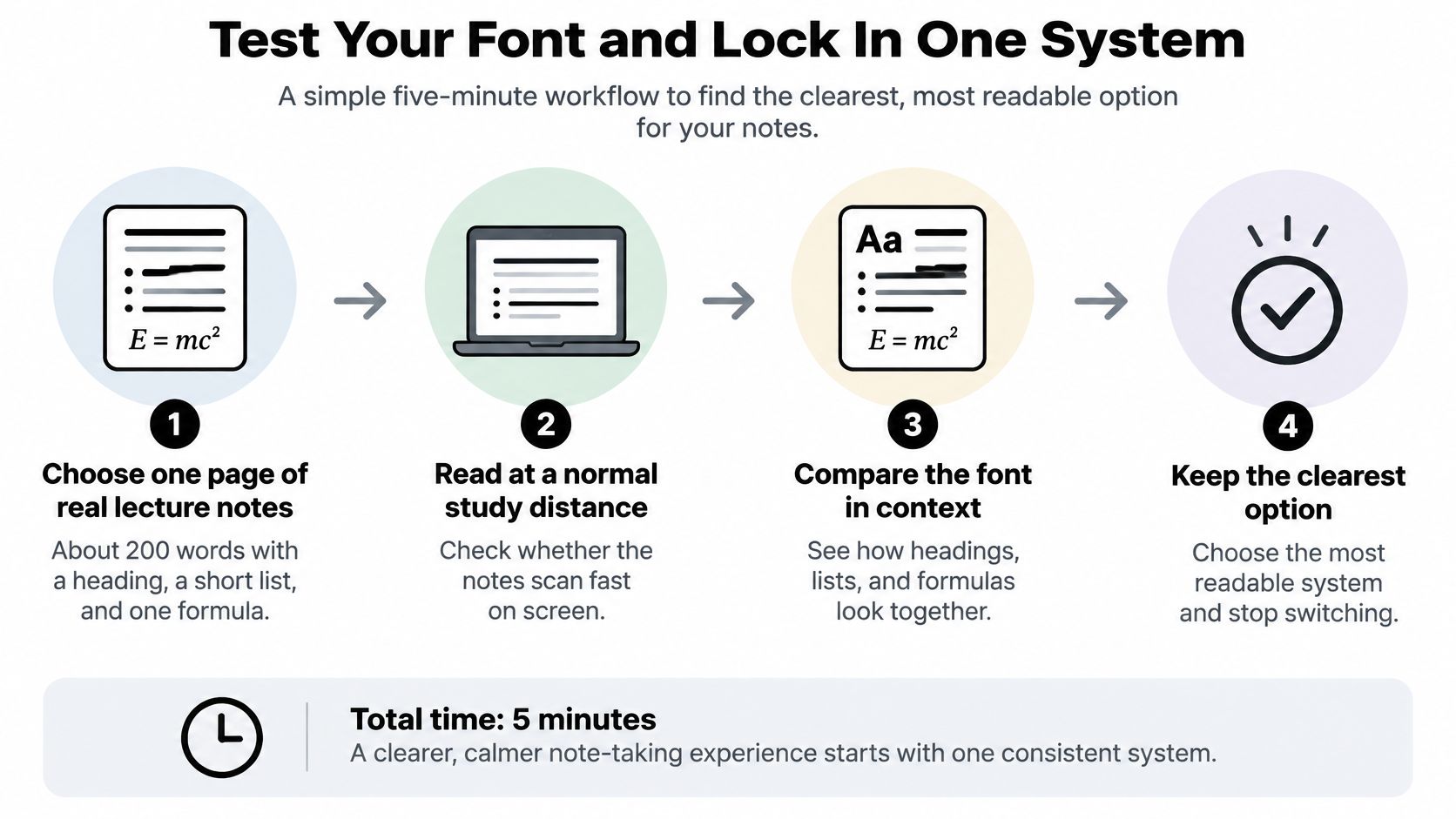
A font list hands you ten candidates and no decision. A five-minute test hands you one answer you can apply to every page for the rest of the term, because it uses your notes, your eyes, your iPad and the distance you hold the screen.
The five-minute test
- Pick one real page. Use about 200 words of actual lecture notes containing a heading, a short list and one formula. Testing on material you'll genuinely revise from is the whole point.
- Duplicate it, one copy per candidate. Set each copy to a different font at the same size. Three candidates is enough: a humanist sans-serif, a neutral sans-serif and a serif. Identical size is what makes the comparison fair.
- Read each copy for two minutes. Notice how quickly you find the key points and whether any letters blur together at speed. The copy that slows you down is the one to drop.
- Adjust the size, then read again. Increase until the lowercase letters feel comfortable at arm's length, then repeat the two-minute check. Most "bad font" problems are size problems wearing a font costume.
- Write one rule and apply it. Something like: one body font at 16 pt, one heading font at 22 pt, nothing else. Save it as the default style for new pages so you're not making the decision again mid-lecture.
The rule that sticks: one body font, one fixed size, one heading font. Consistency lets your eye learn the page layout, and a layout your eye already knows is faster to scan than a prettier one it has to relearn every week.
Why a personal test beats a font list
Font category does influence how people read, which is why the settings are worth touching at all. A study of 97 participants, 48 of them with dyslexia, found that font category affected readability, with sans-serif, monospaced and roman styles outperforming serif, proportional and italic styles in the tested materials. The same work doesn't justify crowning one font for every note-taker, because size, spacing, contrast, screen conditions, language and personal preference all pull on the result. A 2025 study of 98 Greek-speaking adults, including readers with dyslexia, found preferences shifting by writing system and content type, formulas included.
That's an argument for configurability, not for a better list. Your own test settles in five minutes what a recommendation can only guess at.
Where the hardware fits
Testing is easier when the page does the work. On an iPad you can switch font family and size on the page itself, without leaving the document, which is exactly what step two needs. For the handwritten half of the hybrid, the Pencil Pro Lumin is optimized for note-taking and everyday writing with a slightly softer nib feel, so long writing sessions stay comfortable. Tinymoose stylus pens also let you take handwritten notes and convert them into AI-powered summaries, which turns your diagram-heavy lecture pages into typed text you can search in a plain, comfortable font.
For the handwritten side of your study routine, the Tinymoose Pencil Pro Ultra is a practical choice for switching between notes, diagrams and quick sketches on a compatible iPad.
Give the rule two weeks
Apply your saved style to every new page, then come back to the pages you actually re-read after two weeks of real study. If you keep enlarging the same notes, your base size is too small. If you keep losing your place, your heading hierarchy is too weak. Adjust one variable at a time so you know what changed.
Run the test on your next lecture. Two hundred words, three fonts, five minutes, and you'll have a system that makes every future page easier to read than the one before it.
Tinymoose builds stylus pens for exactly this workflow, so you can write concepts and diagrams by hand in class and let the pen's software turn them into AI-powered summaries you can search and re-read in a comfortable, plain font. The Tinymoose Pencil Pro line pairs palm rejection, tilt response and magnetic attachment with the note apps you already use, and the Pencil Pro Lumin's softer nib is made for long writing sessions. Pick one lecture this week, run the five-minute test on it, and give your notes a font that earns its place.

Compartir:
Example of Note Taking: 8 Formats That Work in 2026