
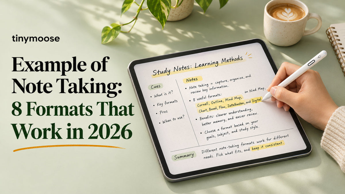
Your lecture starts at 9 a.m., a client call fills the middle of the day, and a sketch is due by Friday. Your iPad can handle all of it, but a page full of loose handwriting won't tell you what to study, what to send, or which design to develop.
The right example of note taking gives you more than an attractive layout. It gives each detail a place and makes the next step obvious. Lecture notes need questions you can answer later. Meeting notes need owners and deadlines. Creative notes need room for experiments that aren't ready to become decisions.
These eight formats work as practical starting points, not rules you have to follow perfectly. You can write, type, sketch, and annotate on the same device. Choose an app that supports the workflow you need, using FruitPunch's note taking app rankings to compare options rather than rebuilding your system around whichever app looks nicest.
Start with the next use: Before opening a blank page, decide whether you'll need to remember, act, explore, or connect ideas.
Keep your first template plain. A readable heading, some open space, and a useful review routine matter more than decorative dividers. You can improve the appearance once you know what information you need to find again.
Table of Contents
- 1. Cornell Note-Taking on iPad
- 2. Layered Lecture Pages With Notes, Diagrams, and Annotated Screenshots
- 3. Mind Mapping for Creative Brainstorming
- 4. Bullet Journal Rapid Logging
- 5. Sketchnoting for Lectures and Meetings
- 6. Sketchbook Concept Pages for Artists
- 7. Meeting Notes With Action Items for Remote Workers
- 8. Zettelkasten Linked Notes for Long-Term Learning
- How the 8 Note-Taking Formats Compare at a Glance
- Pick One Format and Test It This Week
1. Cornell Note-Taking on iPad
A Cornell page has questions down the left, main notes on the right, and a short recap across the bottom. For a university student, that might mean lecture explanations beside prompts such as Why does this process stop? or How would I compare these models?
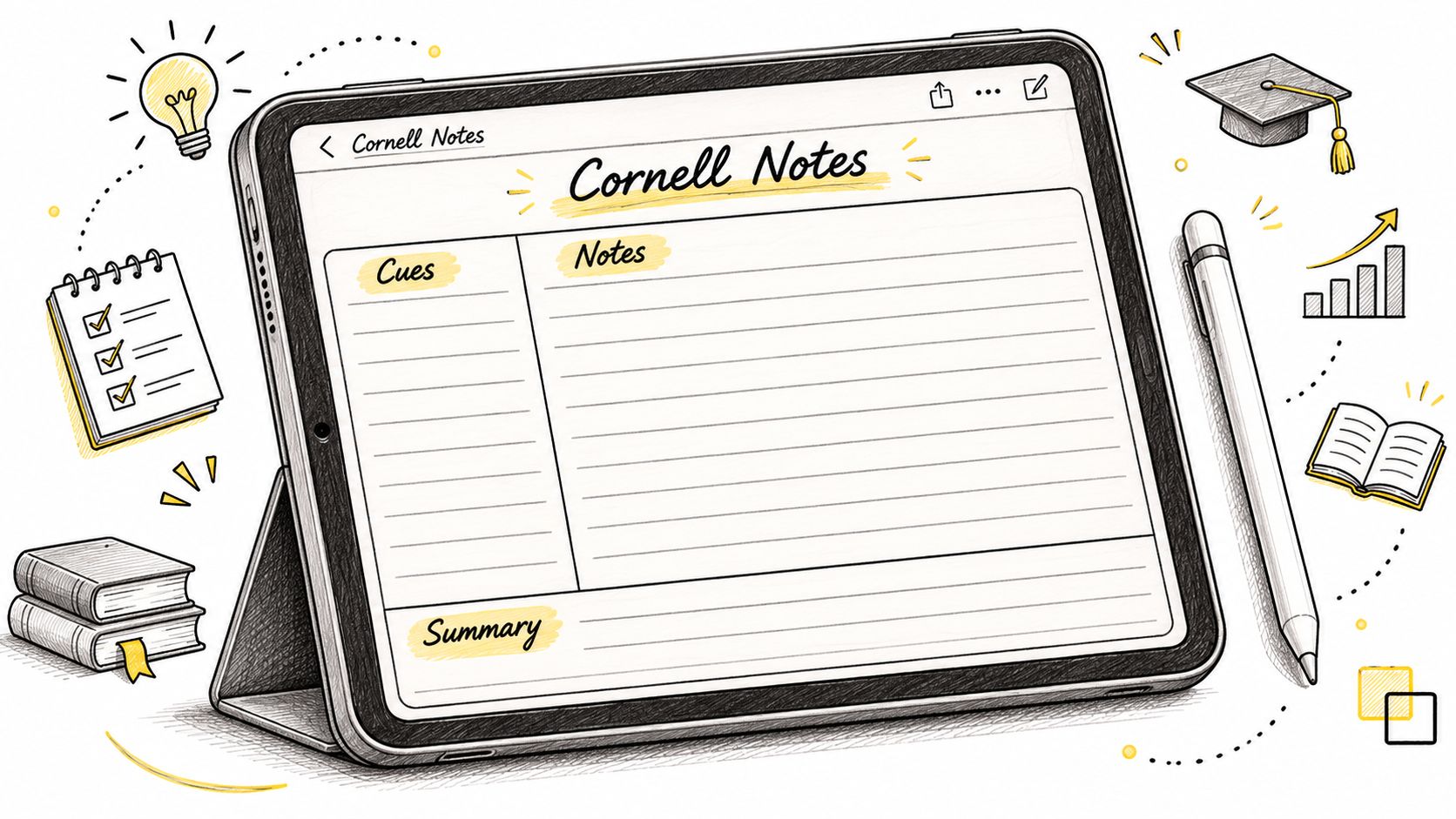
Create the template once, then duplicate it for each class. Leave the cue column mostly empty while listening. Your priority during a fast explanation is capturing the idea, not inventing a polished exam question.
A controlled intervention involving 128 students found mean post-test performance of 30.87 ± 3.47 for Cornell-method students versus 17.95 ± 4.28 for controls, according to the Cornell-method intervention paper. That's evidence from a particular intervention, not a promise that drawing columns alone improves learning.
Make the cue column earn its space
After class, turn the important explanations into questions. Cover the main notes, answer from the cues, and check what you missed. Finish with a brief synthesis in your own words.
- For students: Use a separate template for each course and add cues while the lecture is still fresh.
- For project managers: Put decisions in the cue column and next steps in the summary strip.
- For accessibility: Widen the writing area or type the main notes if a narrow layout makes handwriting uncomfortable.
The trade-off is space. Cornell works well for structured explanations but feels cramped when a lecturer fills the screen with diagrams. Keep those on a linked page rather than shrinking everything to fit.
If you're moving from paper, these approaches to handwritten notes with a stylus can help you preserve the familiar writing routine.
2. Layered Lecture Pages With Notes, Diagrams, and Annotated Screenshots
On a biology student's page, lecture notes run down the left, a cell-cycle sketch sits beside them, and an imported slide carries handwritten arrows. The screenshot preserves the lecturer's visual. The annotations explain what the student understood.
This is the layout to use when a subject keeps changing form. You might need text for a definition, a diagram for a process, and a screenshot for a chart that would take too long to redraw.
Prepare the canvas before class. Import available slides, reserve a margin for takeaways, and leave an open zone for diagrams. Keep main notes dark and use a contrasting annotation color, but add labels so color isn't the only way to distinguish meaning.
Annotate rather than collect
Say a business lecturer presents a case-study chart. Instead of pasting it into the notebook and moving on, circle the relevant change and write what it means beside it. Mark anything uncertain with a question rather than guessing.
A ScienceDaily account of handwriting and laptop experiments reports similar factual recall but poorer conceptual-question performance among laptop note-takers, with a longhand advantage persisting on a delayed test one week later. The useful warning is about verbatim capture, not a blanket rejection of digital notes.
- During the lecture: Capture relationships, explanations, and questions rather than duplicating every slide.
- During review: Hide your annotations and explain the screenshot or diagram aloud.
- When the pace accelerates: Leave a labeled gap and return to it instead of rearranging the page mid-explanation.
The main weakness is clutter. If every screenshot arrives at full size, you'll spend review time scrolling instead of thinking. Crop to the relevant area and keep typed topic labels for search.
3. Mind Mapping for Creative Brainstorming
A designer's page begins with the client's goal in the center, surrounded by branches for audience, visual direction, deliverables, and unanswered questions. Smaller branches hold references, constraints, and possible approaches.
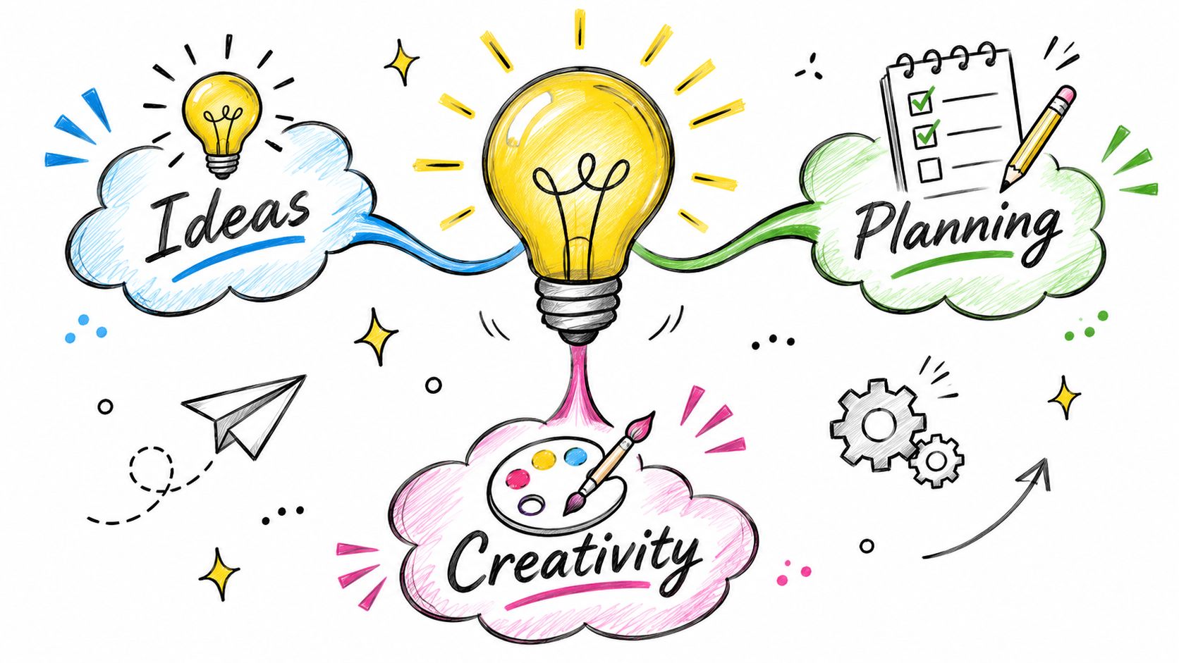
Mind mapping suits work that doesn't arrive in a tidy sequence. A client mentions packaging, returns to the audience, then changes the launch concept. You can add each thought beside its related ideas without forcing the conversation into a linear outline.
Start with a short central label or image. Add branches for the main categories, use a consistent color for each category, and keep individual entries brief. On an iPad, leave enough room to move a branch without squeezing neighboring labels.
A mind map is a workspace for possibilities. Don't treat every branch as an approved requirement.
Turn exploration into something usable
After the discussion, trace each branch and ask what it contains: a requirement, an option, an assumption, or a question. Label those differences explicitly. A bold arrow can show a dependency, but write a few words explaining the connection.
A writer could use the same approach for a chapter, placing the central argument in the middle and branching into examples, objections, and missing evidence. Before drafting, convert the selected branches into a structured outline.
The trade-off is retrieval. A sprawling map may make sense while you're drawing it but become hard to interpret later. Finish with a separate written summary of the chosen direction.
Adaptation tip: If a blank canvas feels overwhelming, draw the category branches before the meeting. If visual processing is difficult, keep a matching text outline beside the map rather than relying on spatial position alone.
4. Bullet Journal Rapid Logging
A remote worker's daily page mixes a task dot beside Send revised proposal, an open circle beside Client review, and a note marker beside Client prefers the shorter introduction. Everything lands in the same running log.
Rapid logging is useful when speed matters more than sorting. You record a short entry, mark its type, and continue working. The sorting happens during review, not every time someone interrupts you.
Keep a simple symbol key on the opening page. Use a dot for tasks, an open circle for events, and a short line for notes. Add completion and migration marks that you can distinguish easily in your own handwriting.
Review the unfinished entries
At the end of the workday, read the page from top to bottom. Complete, reschedule, migrate, or drop each open task. Don't copy something forward just because it's still there.
- For a remote worker: Move an unfinished proposal task to the next appropriate workday.
- For a freelancer: Record a client deadline as an event and keep exploratory ideas as notes.
- For navigation: Maintain an index that points to monthly logs and active project pages.
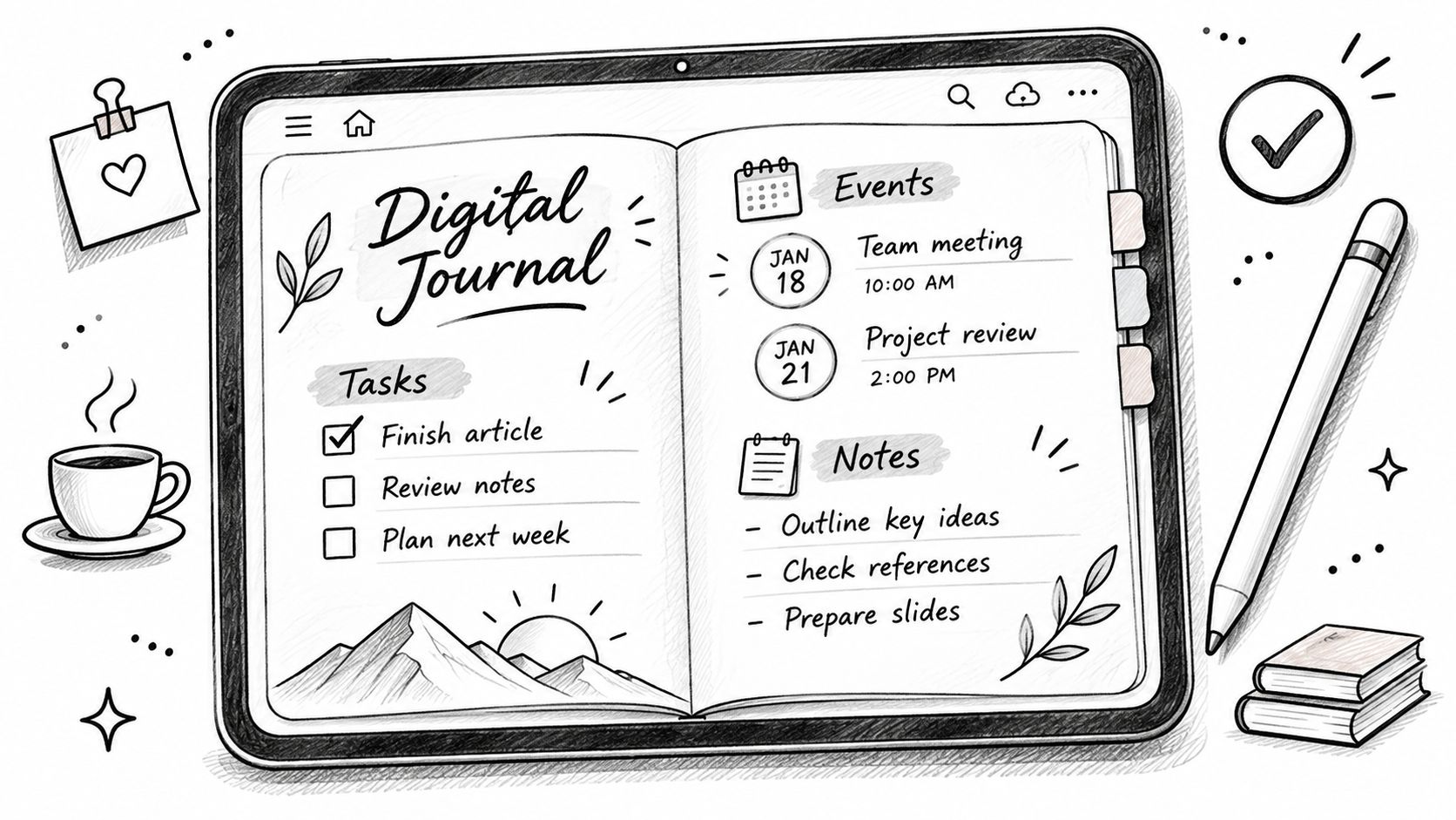
A digital notebook makes it tempting to add elaborate trackers and decorative spreads. Resist that until the basic log is useful. The practical starting point is starting a digital bullet journal that you can maintain during a busy week.
The weakness is shared accountability. A personal task dot doesn't tell a colleague who owns the work. Move team commitments into a shared action list.
Adaptation tip: Replace handwritten symbols with typed labels or accessible checkboxes if the marks become difficult to distinguish.
5. Sketchnoting for Lectures and Meetings
A product-team meeting page shows a warning triangle beside a delivery risk, a checkbox beside a decision, and a name attached to each follow-up. Arrows connect the risk to the affected launch task.
Sketchnoting combines short text, simple drawings, and visible relationships. You don't need polished illustrations. You need symbols you can draw quickly and understand afterward.
For a conference talk, put the main topic near the center and arrange labeled sections around it. For a meeting, follow the agenda more closely so you can locate decisions without decoding an artistic composition.
Build a small visual vocabulary
Practice recurring icons before using them during a fast discussion. Arrows, document outlines, warning signs, and checkmarks are enough to begin. Keep names, conditions, and deadlines in text because those details shouldn't depend on interpretation.
A review of paper-based learning describes how handwriting can encourage selection, summarization, and organization while providing space for diagrams and connections. Apply that principle digitally by drawing to explain an idea, not just to decorate the page.
Pressure test: If an icon takes longer to draw than the idea takes to explain, write the words first.
Use a separate drawing layer if your app supports it. That lets you reposition an illustration without disturbing the written notes. During review, add a plain-text recap and correct any ambiguous arrows.
The demonstration below offers a visual reference for combining writing and drawing.
For lower-pressure practice, try these ways to record your life visually. A personal journal gives you room to build symbols before using them in a consequential meeting.
Adaptation tip: Pair every important icon with a short label. That makes the page easier to share and less dependent on visual interpretation.
6. Sketchbook Concept Pages for Artists
A character designer's page contains a row of rough poses, expression studies underneath, and handwritten comments beside the strongest options. A shading test fills the margin, with the selected treatment clearly marked.
This is note-taking through visual trials. The writing records why an option works, what needs changing, and which experiment deserves further development. Without those annotations, a page of thumbnails can become a collection of unexplained alternatives.
Divide the canvas into zones for thumbnails, material or shading tests, and notes. Keep the zones loose enough that a promising idea can expand. The page should support exploration, not force every sketch into an identical box.
Preserve the reason behind each choice
Suppose an illustrator tests different shading approaches for a cover. Beside each version, write the practical consequence: the face reads clearly, the background competes with the subject, or the texture disappears at a small viewing size.
- Name layers by stage: Use labels such as rough, shading, and final so you can isolate changes.
- Separate status from appearance: Mark a selected concept explicitly rather than assuming the most finished sketch is the approved one.
- Review before sharing: Hide abandoned experiments if they distract from the question you're asking the client.
Precise stylus input helps with small annotations, but don't confuse digital flexibility with unlimited revision time. Keep an untouched rough layer before testing a major change.
The trade-off is searchability. Handwritten comments embedded in artwork may be harder to retrieve than typed text. Add a searchable project title and a short typed description of the chosen direction.
Adaptation tip: Export a client-facing copy at the intended viewing size, then check whether the annotations remain readable. Keep the editable original with its layers and rejected options for your own reference.
7. Meeting Notes With Action Items for Remote Workers
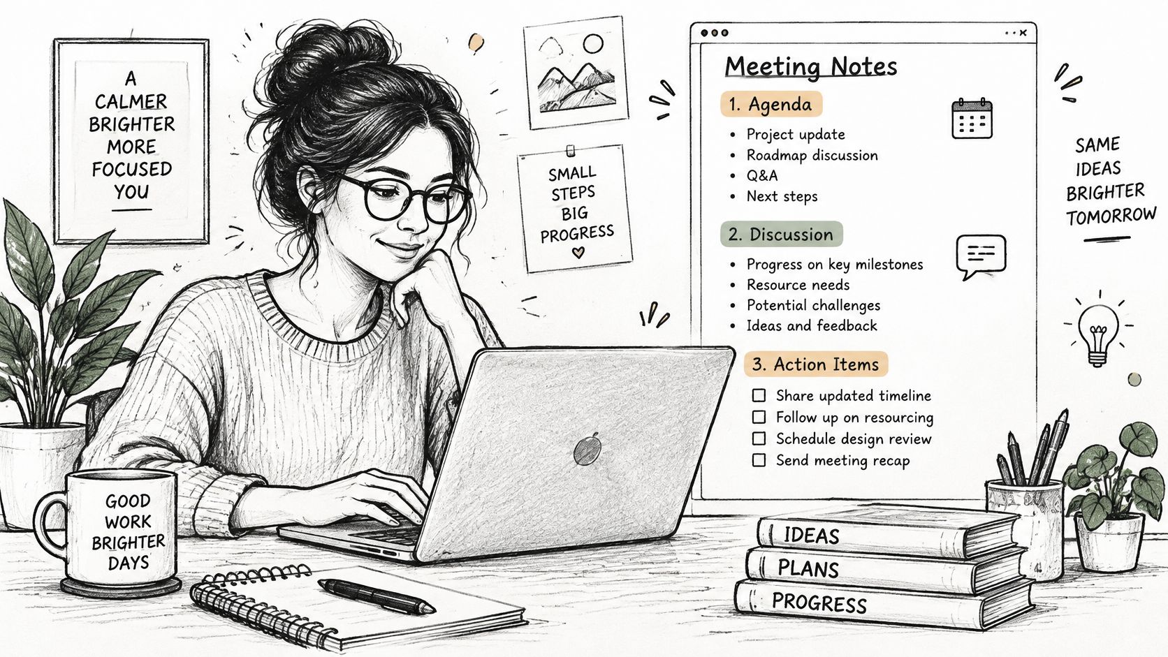
A project manager's page has agenda points at the top, discussion notes underneath, and a fixed action area at the bottom. The final entry reads: Send revised scope, owner Maya, due Friday, rather than Discuss scope later.
That difference matters. Meeting notes should distinguish what participants considered from what they agreed to do. A proposal isn't a decision, and a name mentioned in discussion isn't automatically an owner.
Prepare the agenda before joining the call. During the conversation, use short entries and mark uncertainty explicitly. Before the call ends, read back the decisions and confirm ownership.
Use an action-ready structure
Keep these fields available in the template:
- Context and key point: What problem are participants addressing?
- Evidence and decision: What supports the choice, and what was agreed?
- Task, owner, and deadline: Who will deliver what, and when?
- Open question: What still needs confirmation?
A nursing-education paper on note-taking emphasizes clarity, organization, clinical relevance, and structured documentation formats such as SOAP and SBAR. Office meetings aren't clinical records, but the practical lesson transfers: use headings that make the information's purpose clear.
A consultant can capture client-call decisions with this layout and send a cleaned summary the same day. A project manager can share the action list promptly, then review open commitments at the next meeting. These meeting note methods that stick offer further ways to keep follow-ups visible.
The trade-off is divided attention. Don't attempt a full transcript while facilitating a difficult conversation. Capture the decision, its reason, and its consequences first.
Adaptation tip: Type names and deadlines if handwriting recognition struggles with them. For multilingual teams, expand abbreviations and confirm that everyone interprets the action wording the same way.
8. Zettelkasten Linked Notes for Long-Term Learning
A graduate student's note contains a clear idea in their own words, a source reference, and links to related concepts. It isn't a miniature copy of the entire paper.
Zettelkasten works best after initial capture. Take rough lecture or reading notes first. Later, extract ideas worth keeping and give each a descriptive title that expresses a claim rather than a vague topic.
For example, Customer interviews reveal language for product messaging is more informative than Marketing notes. Beneath it, explain the idea, identify its limits, and link it to related notes about interview questions or message testing.
Make links explain relationships
A link alone says little. Add a sentence explaining whether the connected note supports, contradicts, illustrates, or extends the idea.
- For a researcher: Connect a paper's concept to related findings while preserving the source details.
- For a writer: Link character motivation to scenes where that motivation changes a decision.
- For navigation: Create topic index notes that introduce useful clusters rather than merely listing filenames.
Review by following a chain of links and explaining the connections without copying the original wording. You can use Quotabl's forgetting curve tool as a prompt to think about revisiting material, but keep your own recall attempts central.
The trade-off is maintenance. Splitting every fleeting thought into a permanent note creates work without necessarily helping your writing or learning. Save ideas you expect to reuse.
Adaptation tip: Capture diagrams with a stylus, then add typed titles, explanations, and links. Searchable text and handwritten thinking can coexist without turning every page into a transcription project.
How the 8 Note-Taking Formats Compare at a Glance
| Item | Best For | Setup Effort | Review Style | Stylus Advantage |
|---|---|---|---|---|
| Cornell Note-Taking on iPad | Lectures and structured study | A few minutes to create a template | Self-quizzing with cues and summaries | Keeps headings and small handwriting neat |
| Layered Lecture Pages: Notes, Diagrams, and Annotated Screenshots | Combining lecture notes, diagrams, and marked-up materials | Moderate; organize content on one canvas | Review notes alongside diagrams and annotations | Enables precise diagrams, labels, and markup |
| Mind Mapping for Creative Brainstorming | Brainstorming and exploring connections | Low; start with a central idea | Scan branches and revisit connections | Makes free-form sketching and edits easy |
| Bullet Journal Rapid Logging | Daily tasks, events, and planning | Moderate; establish symbols and logs | Regularly review and migrate entries | Supports quick handwritten logging |
| Sketchnoting for Lectures and Meetings | Visual summaries of talks and meetings | High; requires drawing practice | Scan visual associations and key ideas | Helps create clean lines and icons; layers support edits |
| Sketchbook Concept Pages for Artists | Exploring and recording visual concepts | Moderate; structure zones and layers | Compare sketches, tests, and annotations | Supports precise line work and reversible experiments |
| Meeting Notes with Action Items for Remote Workers | Capturing decisions and follow-ups | Low to moderate; prepare a reusable template | Check action items before the next meeting | Enables quick notes and handwritten checkboxes |
| Zettelkasten Linked Notes for Long-Term Learning | Research, writing, and lasting knowledge connections | High; build a linking and indexing habit | Follow links and topic indexes across notes | Useful for quick diagrams and short handwritten notes |
Pick One Format and Test It This Week
Choose the example of note taking that matches your next real task, not the one that looks most impressive online. Use Cornell for a lecture you'll need to recall, an action-oriented page for a client call, or a concept sheet for a visual problem. Set up the template once and use it for five sessions before judging it.
Keep the review habit attached to the format. Fill Cornell cues, explain annotated diagrams, summarize each page in one or two lines, and migrate unfinished tasks. A clean page is pleasant, but a page you can use afterward is the better result.
Judge the page by what you can do afterward
For study notes, close the source and explain the idea. For meeting notes, check whether someone else could carry out the next step without asking what you meant. For creative notes, make sure you can identify both the selected direction and the reason you selected it.
- If you can't find information: Improve titles, labels, and navigation before changing apps.
- If you can't explain it: Replace copied wording with a summary and a question.
- If tasks keep slipping: Make ownership and deadlines explicit.
- If the page becomes crowded: Move supporting material to a linked page instead of shrinking the writing.
Don't force handwriting when it creates friction. A study comparing longhand, keyboard, and stylus note-taking reported small differences across cognitive measures, with different advantages across input methods. Choose the input that lets you actively process the material and return to it comfortably.
A practical hybrid routine is often enough: handwrite or annotate during the session, add searchable text afterward, and review from questions or actions. You don't have to rewrite the whole notebook to make it useful.
The Tinymoose Pencil Pro Ultra is a practical choice for moving between handwritten notes, diagrams, and quick sketches on a compatible iPad.
For that workflow, our Tinymoose Pencil Pro line offers palm rejection, pixel-perfect accuracy, and tilt sensitivity for writing, diagrams, and markups. Our stylus pens also allow students to convert handwritten notes into AI-powered summaries, and our stylus-and-keyboard bundles save 25%. Treat an AI summary as a draft to check against your original notes, especially when names, qualifications, or decisions matter.
Start with your next session. Prepare a plain template, leave room for uncertainty, and finish with a short recap. Keep what helps you remember or act, and remove anything that turns note-taking into extra administration.
Tinymoose offers iPad stylus pens and compact keyboards for handwritten notes, searchable follow-ups, and portable creative work. Visit Tinymoose to choose tools for your preferred layout, then put them to work on your next lecture, meeting, or concept page.

مشاركة:
7 Best Cyber Monday iPad Deals Worth Buying in 2026