It's 9:05 on a Tuesday, the seminar room lights are at full brightness, and you're two slides behind. You go to write a short definition in the margin, and the nib slides straight past the line you aimed for. You try again, press harder, and the correction sits on top of the first attempt like a scar. Twenty minutes later the notes are legible but hurried, your hand is tight, and the ceiling lights are reflecting off the exact paragraph you need to read.
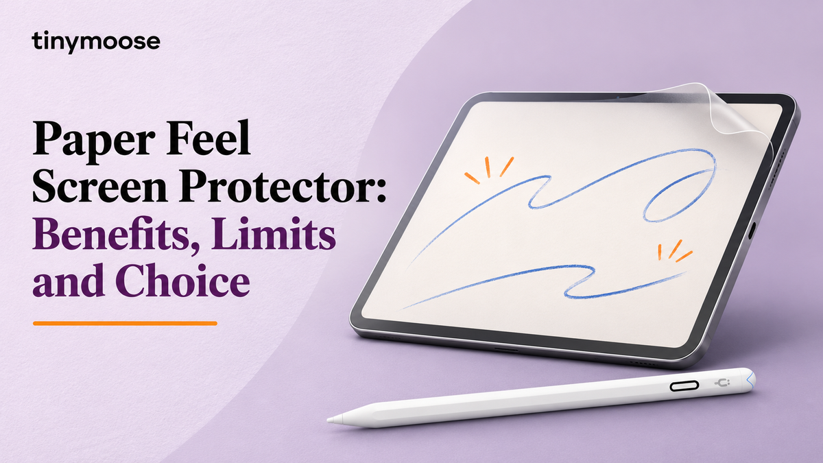
That gap between what your hand intends and what appears on the glass is the reason paper feel screen protectors exist. They're a thin textured film applied over the display that adds drag under the stylus tip. Nothing in the software changes. The iPad registers input exactly as before. What changes is the surface your hand and pen negotiate with, and that turns out to matter more than most spec sheets admit.
It also costs something, in sharpness and in nibs, and any honest version of this decision includes both sides. Here's how the trade works, from the friction numbers up to the moment you peel the backing off.
Table of Contents
- What a Paper Feel Screen Protector Changes on Your iPad
- Friction, Grip and Where Paper Feel Pays Off
- Clarity and Glare, the Trade You Should Check
- Tip Wear and the Real Cost of Owning One
- Matching Protector, Stylus Tip and Task
- Installing a Paper Feel Protector Without Bubbles
- Choose Your Paper Feel Setup for Your Next Session
What a Paper Feel Screen Protector Changes on Your iPad
A ballpoint on paper grips because the fibres compress under the tip and resist sideways travel. The same pen on glass slides like a skate on ice. Nothing yields, so every small wobble in your hand travels straight into the line, and handwriting that looks tidy on paper comes out rushed.
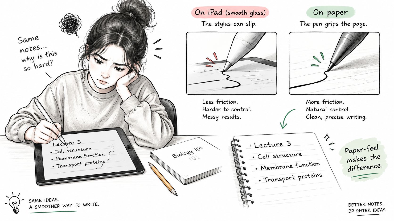
A paper feel screen protector covers the display with a micro-textured layer, so the tip meets controlled resistance on every stroke. Three things are worth being clear about before you buy:
- It's a physical film, not a setting. The iPad registers stylus input the same way it always did. No app needs a new mode, a different tool or a calibration step.
- It doesn't reproduce paper fibres. It approximates the two things paper does that glass doesn't, drag and a small vibration through the pen. The illusion holds well in the hand because those are the cues your fingers read.
- The feel belongs to the pair, not the protector. Film and nib together produce the resistance. Swap the nib and the same sheet can feel heavier or lighter without anything else changing.
That leaves three things to weigh before you commit, in this order: grip, clarity and tip life. Everything else in the buying decision follows from how those three balance for the work you do.
Friction, Grip and Where Paper Feel Pays Off
Resistance is the product. Sharper or softer text, glare, nib wear, all of it follows from how much friction the film adds and how consistently it adds it across the surface.
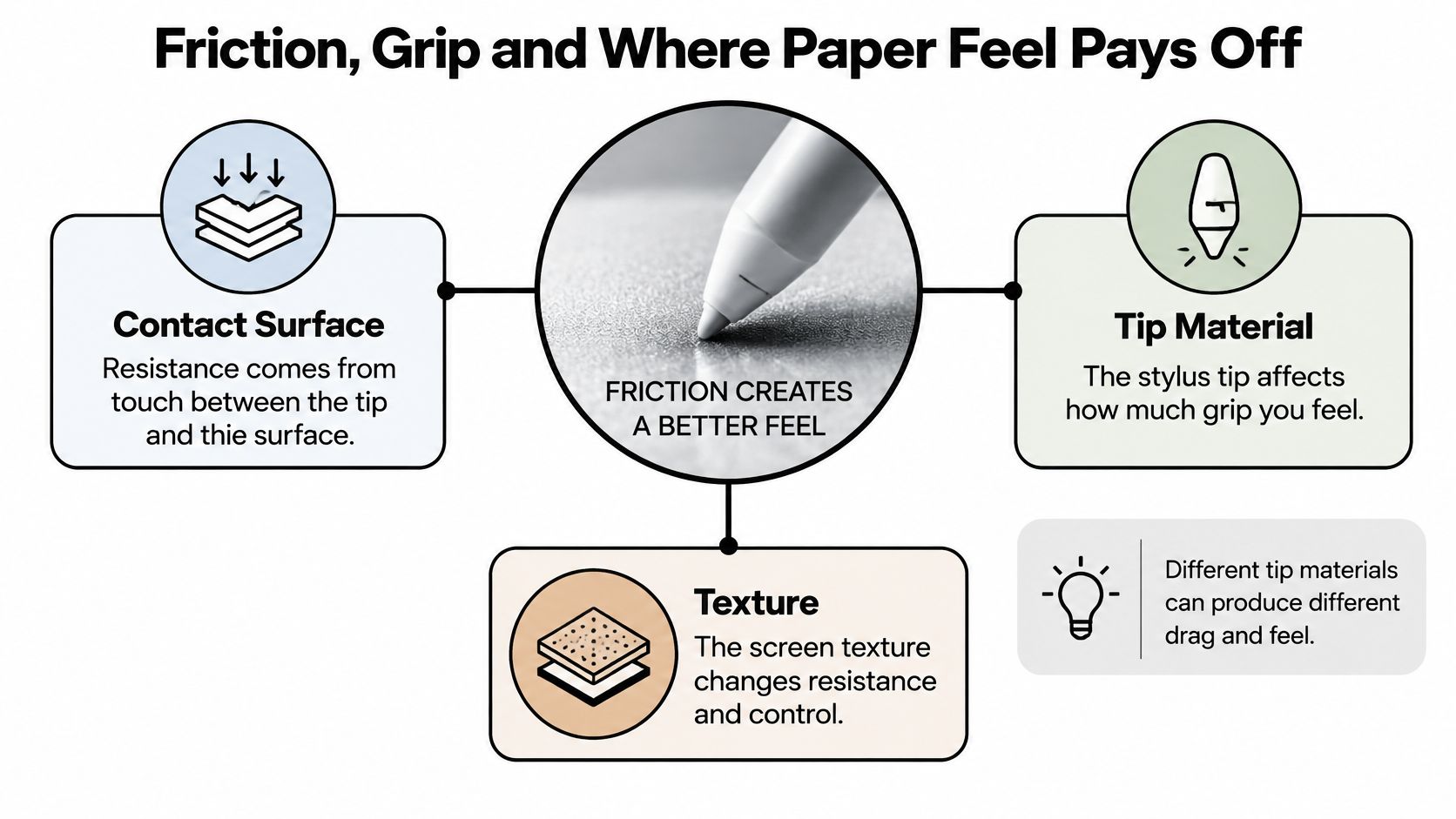
Three variables set the drag you feel, and only one of them is the protector:
- Contact area: a soft tip flattens into the texture, and the texture removes some of the area that would otherwise stick to the glass.
- Tip material: a hard tip behaves the opposite way, catching on high points rather than pressing around them.
- Texture scale: the size of the bumps, from nanometre-scale asperities up to sub-millimetre and millimetre pitches, decides which of those two behaviours wins.
The research is specific about this. A 2025 report on open-access work by Nippon Electric Glass and Kumamoto University compared three commercial stylus tip materials, elastomer, polyacetal and hard felt, on flat and micro-textured glass, as Ceramic Tech Today summarised. Texture did not produce one universal result. It reduced the friction coefficient for the elastomer tip and increased it for both polyacetal and hard felt.
The explanation is mechanical rather than mysterious. Texture cut the elastomer's real contact area, which lowered adhesion friction. The harder tips caught on nanometre-scale surface asperities and on larger sub-millimetre or millimetre pitches, which raised abrasive friction. So the writing experience depends on the interaction between texture, tip material and texture scale, not on whether a sheet carries a matte label.
Buying rule: judge a paper feel screen protector with the nib you actually write with. The same sheet that feels controlled under one tip can feel rough and resistant under another.
Friction work on tactile perception points the same direction. Perceived roughness rises with friction-related vibration, and tool size, applied force and drawing speed all change what you feel, as a study of stylus texture perception sets out. A film with more tooth cuts lateral slip on slow strokes, curves and diagonals. Push the texture too far and every stroke costs more force, while fast scrolling starts to feel draggy.
Here's how the surfaces compare for a stylus user:
| Surface | Stylus feel | Control on slow strokes | Glare | Image sharpness |
|---|---|---|---|---|
| Bare glass | Slick, quick glide | Lower, lines can overshoot | Highest reflections | Highest |
| Micro-textured paper-feel film | Grainy, noticeable drag | Higher, steadier curves | Reduced | Slightly softer |
| Matte anti-glare film | Light texture, moderate drag | Moderate | Reduced | Slightly softer |
Watch an artist place a long diagonal on a textured film. The tip lands where it's aimed and the line ends there, because the stroke bleeds off energy through the texture instead of skating on. That's the payoff in one gesture, and it repeats on curves, hatching and small lettering where control matters more than speed.
The daily benefits cluster into four:
- Control on slow strokes. Curves, diagonals and fine lettering stop drifting past their intended endpoint.
- Comfort over long sessions. You stop pressing harder to compensate for a slippery surface, which is what makes the last page of notes look worse than the first.
- Glare control near windows and in bright classrooms. A textured surface scatters reflections instead of returning a mirror image of the ceiling lights.
- No workflow change. Apps need no new settings, and nothing about the stylus protocol changes.
The caveat is symmetry. Excessive friction raises the force required per stroke and makes rapid swipes and scrolling feel sluggish, which is why mixed use usually wants moderate texture rather than maximum tooth. If you write, scroll, type and read on the same device, the heaviest film in a range is rarely the right pick.
Paper feel pays off most in four tasks: long lecture notes, diagrams, PDF annotation and precise sketching. Test on the second and third of those before you decide, because they combine slow strokes with frequent swipes and expose an over-textured film quickly. Test with the nib you use, not the one that came in the box.
Clarity and Glare, the Trade You Should Check
The anti-glare benefit is real and the cost is real, and they come from the same mechanism. A matte surface scatters light instead of returning a sharp mirror image, so the room's lights stop sitting on top of your document. Scattering is indiscriminate, though. It treats the light leaving the display the same way it treats the light bouncing off it.
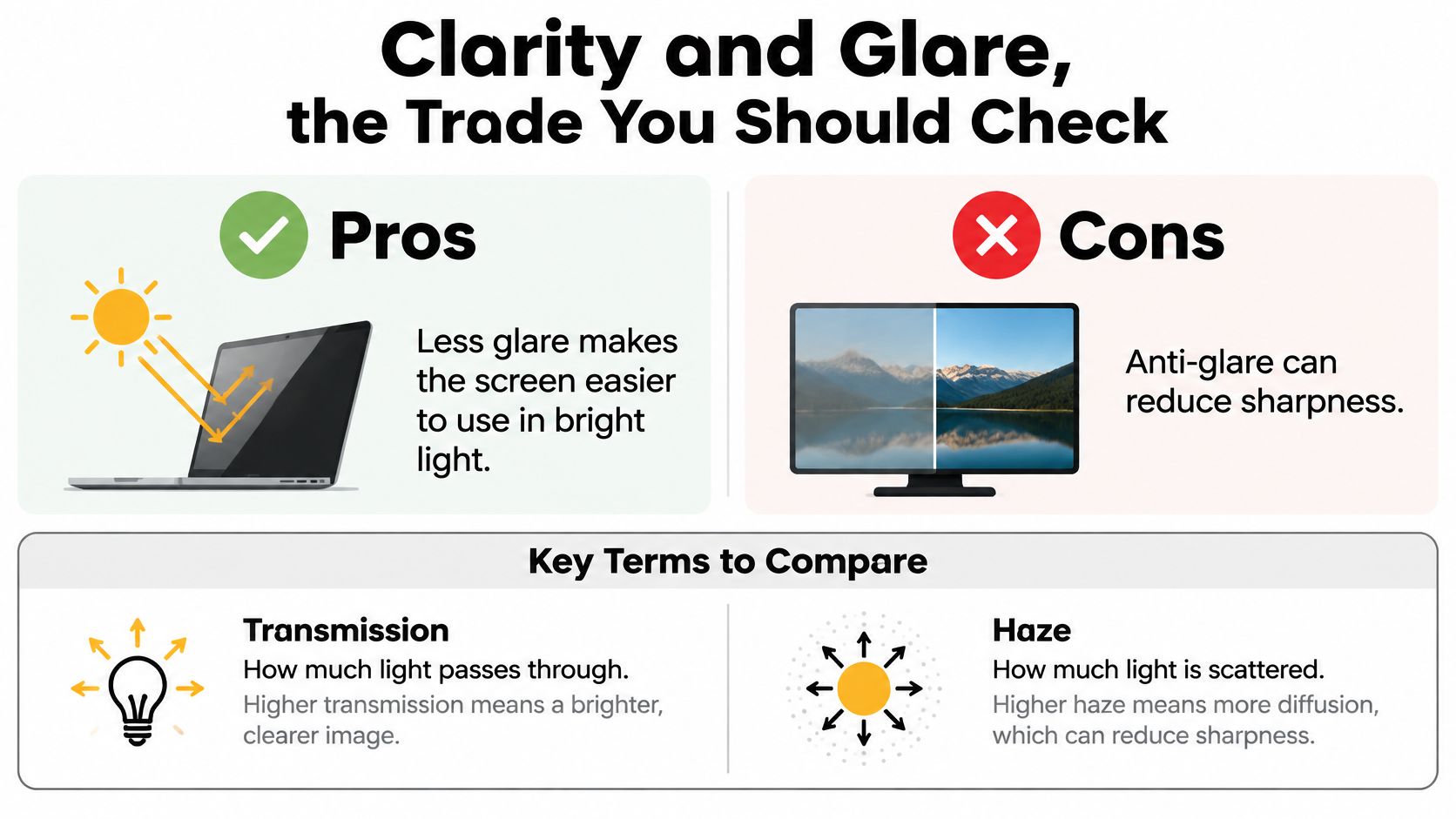
Two measurements explain why a matte sheet can look dull even when the numbers are good. Transmission is how much light passes through. Haze is how much of that light scatters on the way. Transmission figures are strong: a technical materials guide reports visible-light transmission above 94% for one matte anti-glare film, and up to 95% for a clear hybrid glass product under ASTM D1003 testing, according to Neoxum's display protection materials guide. Those numbers say almost nothing about sharpness, because transmission can stay high while haze softens fine text, lowers contrast and adds grain or sparkle on white backgrounds and high pixel density screens.
Selection rule: compare transmission and haze measured by the same test method, and ignore "HD" or "paper feel" as a quality claim on its own.
Sort tasks by how much haze they tolerate
Annotating documents in a bright room sits at the tolerant end. You're reading your own marks and the passage around them, and modest diffusion gives you a screen you can see.
Colour work sits at the strict end. Photo retouching, video grading and illustration where you judge tone and edge quality need lower haze, because surface scattering makes tonal comparisons and fine edge inspection unreliable.
Long-form reading falls in between, and it's where the disappointment usually lands. A sheet that felt excellent under the pen can make small serif text look slightly furry for the next two hours.
Run one check before you commit. Open a plain white page and a page of fine text, then look at both from three angles under the light you work in. Note any sparkle, any softness at the edges of letters, and whether the glare reduction is worth it for the room you sit in.
Tip Wear and the Real Cost of Owning One
The grip that steadies your lines turns the nib into a consumable, and almost nobody puts that on the box. One published comparison, in a Paperlike explainer on paper-feel alternatives, reports the following figures for writing cycles before tip wear:
| Screen surface | Approximate writing cycles before tip wear | What it means for ownership |
|---|---|---|
| Bare screen | About 156,000 | Longest tip life, least grip |
| Lighter-texture protector | About 67,000 | Moderate wear, balanced feel for mixed use |
| Heavier-texture protector | About 24,000 | Fastest wear, plan for spare tips |
Treat those as a ratio, not a lifespan. They come from one comparison, and real wear depends on writing pressure, how often you write, the condition of the tip and the texture itself. A student who writes four hours of lecture notes a day will reach the lighter-texture figure far sooner in calendar time than someone who sketches on Sunday afternoons. A heavy hand shortens every one of those numbers.
The practical response is three habits, not a spreadsheet:
- Inspect the nib every few sessions for a flattened face or a shiny polished spot. Both mean the tip has worn into a shape that changes how it contacts the film.
- Rotate or replace before the line width changes. A worn nib starts producing uneven stroke weight and a faint scratchiness that feels like the protector has gone bad when it hasn't. If lines are already skipping, fix a dragging Apple Pencil before blaming the film.
- Budget spare tips when you choose a heavier texture. Two nibs in a drawer costs less than a week of degraded writing while you wait for a delivery.
The strongest grip isn't automatically the best buy. Maximum texture improves control for a narrow set of tasks and quietly converts your stylus into an accessory with a replacement schedule.
That's the point most comparisons skip. Short-term writing comfort and long-term ownership cost pull in opposite directions, and the right answer depends on how many hours a week you put the pen down on the glass.
Matching Protector, Stylus Tip and Task
Four matches decide whether the setup works, and getting three of them right still leaves the fourth to spoil the feel.
Start with the tip, because everything else depends on it. Elastomer, polyacetal and felt nibs respond differently to identical texture, so confirm your stylus has a replaceable nib and check what it's made of before you shop for film. Our Pencil Pro 2 Nibs come in Black and White and twist off and on, which turns a worn tip into a short swap instead of a reason to stop writing. The Pencil Pro 2 itself is the latest generation of our stylus line, with refined gesture controls and improved tip responsiveness.
Match texture level to how you hold the pen. For mixed use, writing plus scrolling plus reading, choose a moderate matte texture. Reserve a firmer texture for controlled line work where you rarely swipe mid-task.
Then match the task. Note-taking rewards grip and tolerates haze. Photo and colour work rewards low haze and punishes texture. If your week is mostly PDF markup, annotating PDFs without losing comprehension covers the reading half of the same workflow, and it's worth reading before you decide how much softness you can live with. Students building a tablet note-taking workflow for students should test the film during a full lecture, not a two-minute scribble.
Confirm the device fit last, but confirm it. Protectors are cut per iPad model and generation, and a sheet sized for one 13-inch iPad won't sit correctly on another. Check that your stylus supports the pairing you intend, then write with the exact nib you'll use daily, because friction belongs to the stylus and film together.
The mistake to avoid: assuming more texture is always better. Maximum friction helps a narrow set of tasks and shortens tip life. Choose the lightest texture that still steadies your lines.
Installing a Paper Feel Protector Without Bubbles
Installation decides whether the film performs. A single dust particle trapped under the sheet leaves a permanent bubble, and a crooked edge leaves you with delayed touches near the bezel that feel like a fault in the iPad.
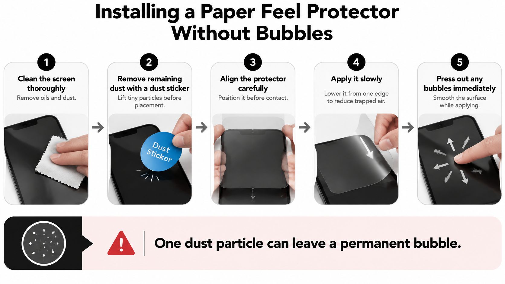
Work through these in order:
- Clean the screen thoroughly. Wipe away fingerprints and oils first, because adhesive won't bond over a smudge and the film will lift later.
- Remove remaining dust with a dust-removal sticker. Press the sticker down and peel it up across the whole panel, since airborne fibres settle in the seconds after wiping.
- Align the top edge and the camera or speaker cutouts before contact. Position it dry, because once a corner touches glass you're committed.
- Lower the film slowly from one end. Gradual contact pushes air ahead of the sheet instead of sealing it underneath.
- Press from the centre toward the nearest edges. Trapped air leaves the film at the boundary rather than being trapped in the middle.
- Smooth with a microfibre-wrapped card or the included squeegee. Even pressure with a soft edge clears air without scratching the texture.
Small bubbles aren't a reason to start over. Guidance on installing a screen protector cleanly notes that bubbles under about 1 mm often disappear within 24 hours as the adhesive cures. A bubble with a visible dust speck inside won't, so lift the nearest edge, remove the particle and lay it back down.
After installation, test the edges. Run a finger along the full border and tap near each corner. A poorly aligned film can produce delayed input or dead zones, and the fix is repositioning now rather than living with it. If the sheet has already taken a knock and done its job, this guide on how to replace a cracked iPad screen protector walks through the swap.
Choose Your Paper Feel Setup for Your Next Session
Three profiles cover most readers, and each accepts a different trade.
The long-hand note-taker. You need grip and moderate haze, and you should plan for periodic spare tips, because the texture that steadies your handwriting is the same thing wearing the nib down. Softer text is the price of notes you can read back without squinting.
The artist chasing controlled lines. You need lower haze and a texture you can feel on slow strokes. Wear arrives faster on this kind of work, so budget for spare nibs up front and treat the replacement cost as part of the tool, the same way you'd accept buying paper.
The reader and commuter. You want glare control in bright rooms and trains. A moderate matte film gives you that, costs a little softness in fine text, and spares you a heavy texture you'd only experience as drag. Plenty of people already accept this compromise: a 2026 Paperlike listing on Amazon Belgium states the film had been adopted by more than 2.4 million designers worldwide.
Then test the pairing yourself. Write for one week with your own stylus and protector, check the nib after a few sessions for flattening or a shiny spot, and note whether fine text still looks crisp enough for the reading you do. A nib that flattens early is telling you the texture is winning, so scale the grip to how much wear you're willing to pay for.
If the pairing feels right, the Pencil Pro 2 in Midnight Black is priced at $39.95 and includes palm rejection, tilt technology, shortcut buttons and a magnetic attachment.
Tinymoose builds stylus pens and iPad accessories for people who write and sketch on a tablet every day. The Pencil Pro 2 adds gesture controls and a nib you can twist off when it wears, and the replacement nibs come in Black and White. If you're still deciding on the pen half of the setup, browse the Pencil Pro 2 and the nibs at Tinymoose and match the tip to the texture before you buy either.
مشاركة:
Active Stylus for Android: Compatibility Guide for 2026