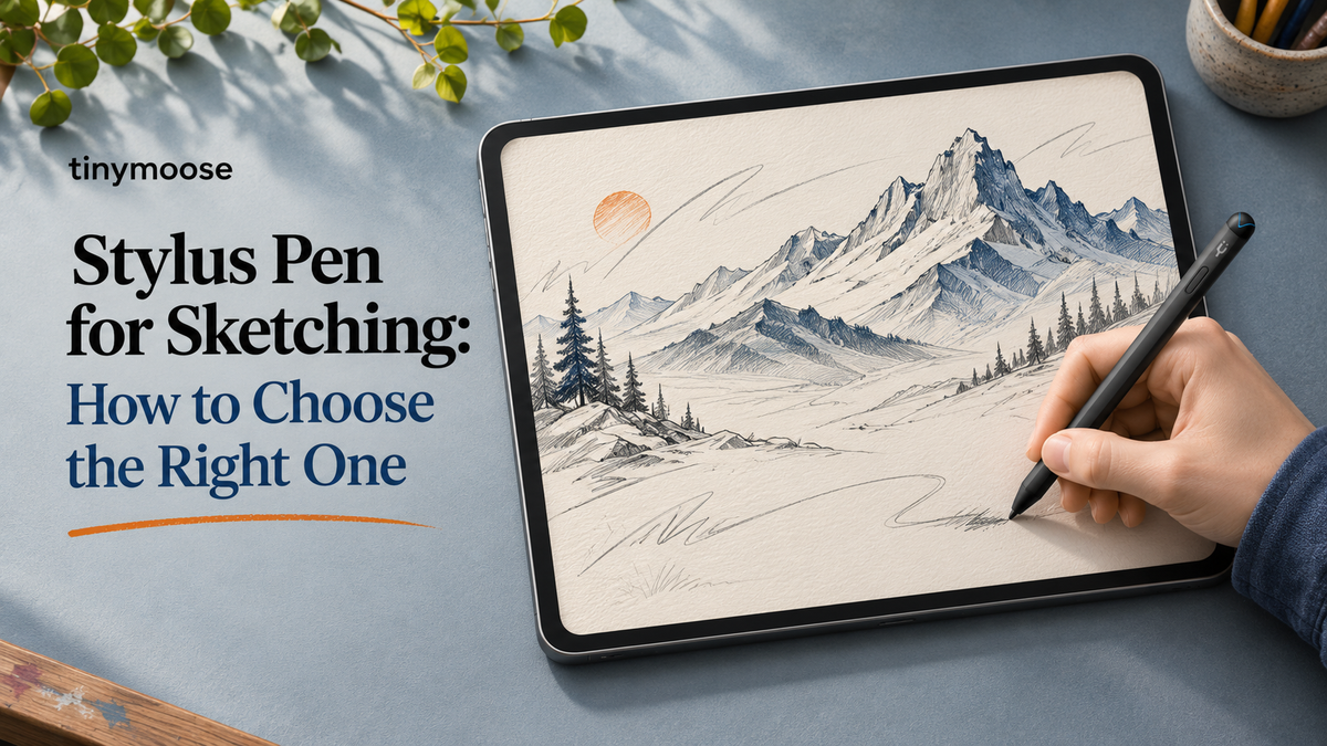
The sketch is going well until you need a shadow under the jaw. You lean in, drag across the cheekbone, and get a flat grey smear with the same density at the edge as in the middle. The problem isn't your drawing. It's the tool telling the app only one thing: where the contact point is.
A stylus pen for sketching reports how hard you press, at what angle the tip meets the glass, and how quickly that contact moves, so the drawing app can turn those signals into line weight, opacity and shading width. Get those signals right and the screen starts behaving like paper. Get them wrong and you'll fight the pen on every stroke.
Spec sheets are a poor guide to that. A pen with a long feature list can still feel dead in the hand if the pressure response jumps, the trailing ink drags behind your wrist, or the barrel is too slim for the way you hold a pencil. What follows is how to read those specs, what each one changes on the page, and how to test a pen inside your own setup before you commit to a long project.
Table of Contents
- Why Sketching Needs a Dedicated Stylus
- Sketching Stylus Specs at a Glance
- How Pressure and Tilt Shape Your Line
- Latency and Tip Feel Decide Whether Strokes Feel Natural
- Palm Rejection, Charging and iPad Compatibility Checks
- Grip, Barrel Size and Long Session Comfort
- Matching Your Stylus to Your Artist Type
- Confirm Your Match Before You Buy
Why Sketching Needs a Dedicated Stylus
A fingertip or a rubber-tipped capacitive stylus can only tell the tablet that something is touching the glass. Drag it across a shaded area and you get a uniform grey band, the same density everywhere, because the app has no idea how hard you pressed or whether you turned the tip onto its side. Shading by hand depends on both of those things.
A dedicated sketching stylus pairs with the tablet's pen digitizer, which is a separate sensing layer from the touch layer. That means the app receives pressure, tilt and position as distinct values it can map to brush size, opacity and edge softness. It's the difference between painting a shadow and smearing one.
Three things change the moment you switch to a proper pen. Line control comes first, because strokes taper on contact and release at the end. The stroke feels natural when the ink tracks the tip instead of chasing it. And your hand can rest on the glass while you work, with palm rejection ignoring the wrist. Lose any of those three and sketching turns into admin.
Mainstream, not niche: among people who had acquired or used digital-drawing devices, 91% used tablets with stylus functionality, according to Kantar research cited in the 2024 XPPen Professional Drawing Tablet Computer Trends White Paper. For most people who draw on a screen, the pen is the default tool rather than an optional extra.
Stroke control is worth practising separately from the gear. If your work leans toward bold graphic outlines, how to sketch clean tattoo linework covers the habits that make a line read cleanly at size, and those habits transfer straight to a tablet.
The buying decision comes down to three questions: which features matter for your kind of sketching, how to test them in the app you use for real work, and how to match the pen to your hand rather than to a specification table.
Sketching Stylus Specs at a Glance
Read the spec list in the right order and it stops being noise. Every row below changes something visible on the page, and each one has a target you can check before you pay.
| Feature | What it controls | What to look for |
|---|---|---|
| Pressure sensitivity | Line weight and tonal range | 4096 levels or more, with a smooth pressure curve |
| Tilt support | Shading width from the pen side | Tilt reported to the drawing app, not just the hardware spec |
| Initial latency | Whether the stroke starts where you touch | Near-instant first mark |
| Trailing latency | Follow-through on fast curves and diagonals | Consistent lag-free ink across the whole stroke |
| Palm rejection | Stray marks from a resting hand | Reliable during fast, long strokes |
| Tip type | Friction, grip and line feel | Fine tip for line art, softer or wider tip for shading |
| Charging | Pen readiness between sessions | USB-C fast charge or magnetic charging |
| Barrel diameter and weight | Grip comfort and control | Thin barrel for a pinch grip, thicker barrel for a relaxed hold |
| iPad compatibility | Pairing and feature support | Matches your iPad model, connector and iPadOS version |
The top three rows decide whether a pen can sketch at all. Pressure and tilt are what turn a contact point into a mark with weight and width. Latency is what keeps that mark attached to your hand. A pen that fails any of those three isn't a sketching tool, whatever else it offers.
Where the Numbers Mislead
A headline level count tells you how finely the pen divides its force range. It doesn't tell you whether those divisions are spread evenly across the press, and that distribution matters far more than the total. A pen that spends most of its travel in the top few grams of force will feel like an on-off switch in the hand.
Compatibility is the other often-misread row. "Works with iPad" is a family claim, not a per-model one. Pen generation, connector type and iPadOS version all change which features reach the app, and plenty of features stop at the pairing stage without ever surfacing in the brush engine.
Rule of thumb: a pen that scores well on pressure, tilt and latency covers most sketching work. The remaining rows decide comfort, fit and how often you have to think about the pen at all.
How Pressure and Tilt Shape Your Line
A pencil gets darker when you press harder and wider when you roll it onto its side. That double behaviour is the whole reason graphite feels expressive, and it's the behaviour a sketching stylus has to reproduce before a screen feels like paper.
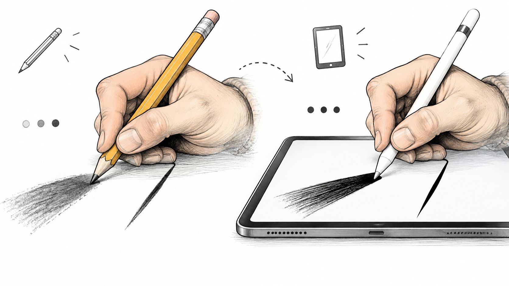
Pressure is the first half. Press lightly and the app draws a thin, faint line. Lean in and the line thickens and darkens. What separates a good pen from a mediocre one isn't the maximum on the box, it's the shape of the journey between those two states.
Pressure mapping and the shape of the curve
Some pens jump from hairline to slab within a few grams of force. Hatching becomes a staircase instead of a gradient, and tonal transitions across a face or a fabric fold turn blocky. A smooth mapping spreads the change evenly across the whole press, so a small change in force produces a small change in width.
You'll notice this most in slow work. Fast gestures hide a coarse curve because the eye is following motion. Slow shading exposes it, because you're making dozens of small decisions per second and the pen has to answer every one of them.
Tilt is the side of the pencil
Held near-upright, the pen makes a narrow mark. Flatten it toward the screen and a tilt-aware app widens the stroke and softens the edge, which is how side-shading with graphite works. Without tilt, you get the same hard round dot at every angle, and soft shading becomes a job for the opacity slider.
Apple's developer guidance lists four inputs a drawing app can read from a stylus: force, altitude or tilt, azimuth or orientation, and barrel roll, as set out in the Human Interface Guidelines for Apple Pencil and Scribble. Force and tilt carry most sketching. Azimuth and barrel roll matter for brush types where a chisel nib rotates as you turn the pen, and you can ignore them until you start building custom brushes.
The two-minute check
Draw three short strokes at light, medium and heavy force. Then repeat them near-upright, at roughly 45 degrees, and close to flat. What you want is continuous change: each pass visibly wider or darker than the one before, with no jump between medium and heavy.
If the medium and heavy strokes look identical, the pen or the app is topping out early and your shading will stay flat no matter how carefully you draw. If the flat pass produces exactly the same width as the upright pass, tilt isn't reaching the brush engine at all.
Latency and Tip Feel Decide Whether Strokes Feel Natural
You feel latency before you can name it. The tip touches down and the ink shows up a beat later, or a fast curve gets dragged behind your hand like a trailer. It reads as clumsiness on your part, and it isn't.
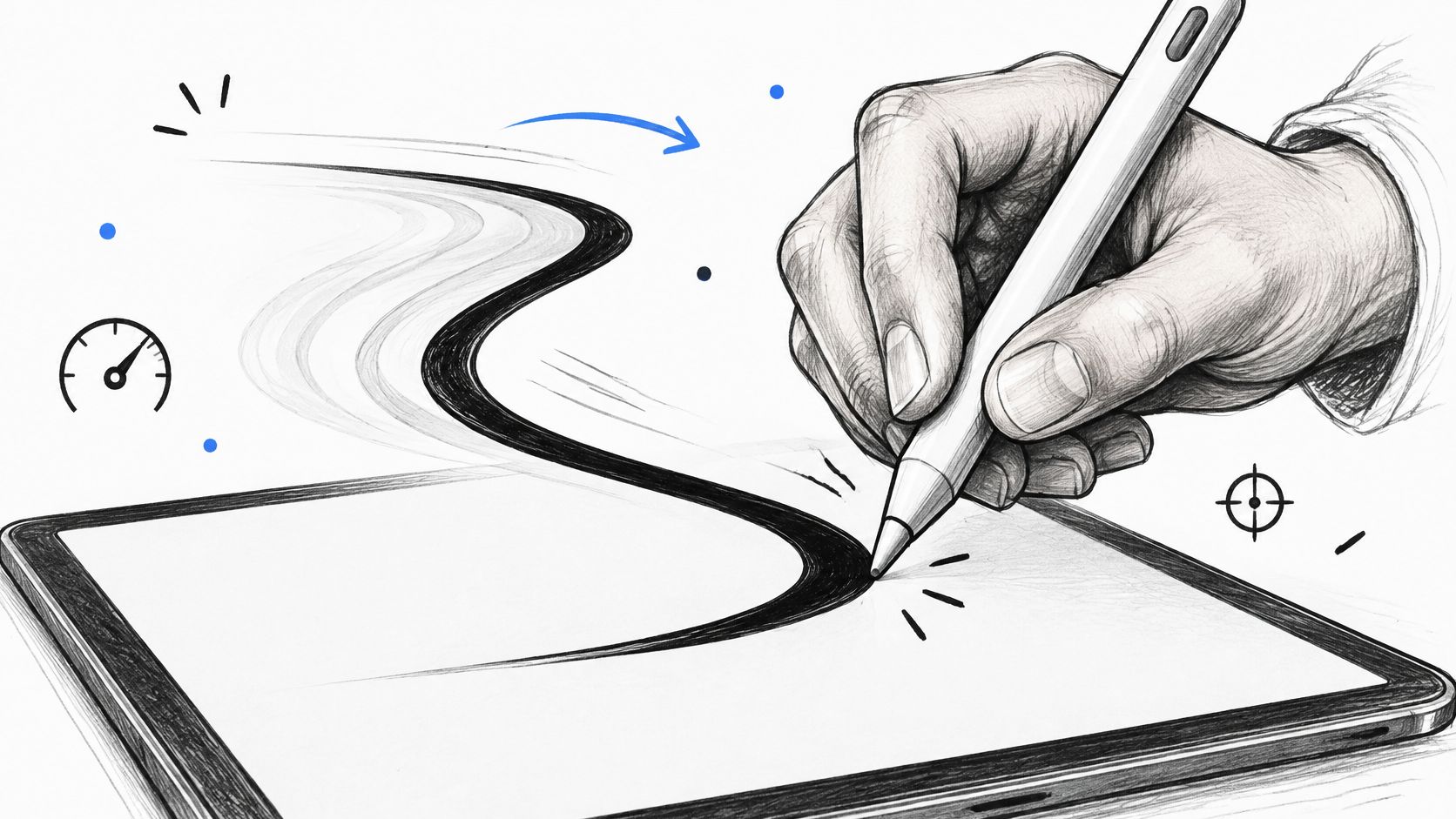
Two measurements matter, and they behave differently. Initial latency is the gap between first contact and the first visible mark, and it decides whether a stroke begins where you meant it to. Trailing latency is the delay during the continuing stroke, and it's what you notice on a long fast arc, at the start, the midpoint and the end of the line.
Human-computer-interaction research cited in a Springer chapter on inking latency reports that inking delay can be perceptible at approximately 50 ms, while non-inking interactions may be noticed at roughly 2 to 7 ms. That gap explains a lot. A pen that feels instant when you tap a menu can still feel mushy halfway through a stroke.
A single tap hides trailing lag completely, which is why quick in-store tests mislead. Test with continuous diagonals and fast curves instead, and watch for the three failure shapes: a line that lags behind the tip, corner overshoot where the ink overshoots a turn and doubles back, and a floating sensation where the mark and the nib seem to be two separate things.
Tip feel is the other half of the stroke
Latency gets the spec sheet, but friction decides how well you can control the line you just drew. Bare glass is slippery, and a hard tip on it skates through slow, deliberate marks. A softer or textured tip adds drag, which steadies fine hatching and small detail, at the cost of a slightly duller feel on fast gesture drawing.
Screen protectors change the equation. On a matte or paper-textured surface, a hard nib can feel scratchy and a softer one settles in nicely. On bare glass, a softer tip is often the difference between controlled shading and a series of micro-slips. Softer tips also wear faster, so buy a pack of replacements with the pen rather than after the first flat spot appears.
A published stylus testing methodology from TechGearLab measures inking accuracy alongside delay and pressure response, because a pen can be fast and still place the mark a millimetre from the nib. Accuracy is what you feel as "the pen draws where I look", and it's worth checking separately from speed.
Practical rule: judge latency on the longest, fastest line you'd actually draw in a finished piece, never on the first tap.
Watch the stroke behaviour in the clip below, then repeat the same motion on your own tablet with your own brush.
Then run three tests of your own. Fast diagonals across the full screen, to expose trailing lag. Tight curves around a small circle, to expose corner overshoot. And a slow shaded fill, to expose a pressure curve that steps rather than glides. If the ink stays with the tip through all three, the pen and the app pipeline are working together.
Palm Rejection, Charging and iPad Compatibility Checks
You're 40 cm into a single contour line and a grey dot appears under your wrist. The stroke you were drawing now has a stray mark attached to it, and the concentration is gone. That's palm rejection failing, and it's the least glamorous feature that decides whether a pen is usable for real work.
Palm rejection is the pen layer telling the tablet to ignore large, flat contact and listen only to the fine tip. When it works, your hand rests on the glass the way it rests on paper. When it half-works, you get a dot at the start of a long line, or a smudge where the heel of your hand settled mid-stroke.
Research on stylus-and-tablet systems found measurable latency, positioning delays and step-wise line behaviour even when users rated the overall experience as satisfactory, as reported in an ACM study of pen-and-tablet interaction. Palm rejection belongs in the same category. It holds under the conditions it was tuned for, and it can wobble when the stroke gets faster or the app changes how it handles touch input.
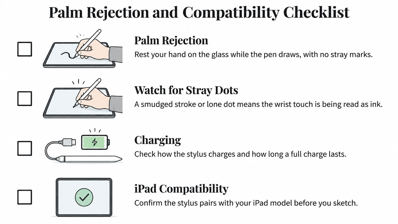
If you want a closer look at how palm rejection behaves across different iPad models and everyday sketching setups, Tinymoose iPad stylus advice goes through the practical differences.
Charging changes how you start a session
Charging is a workflow feature pretending to be a footnote. A USB-C pen takes a short top-up from the same cable as your tablet, which means a five-minute charge before a session is realistic. A magnetically attached pen charges on the iPad edge, so it stays with the device and rarely runs flat at the wrong moment.
The Tinymoose Pencil Pro Ultra costs $49.95 and charges via USB-C, so you can top it up between sketching sessions.
Battery-free EMR pens skip charging entirely on compatible tablets, because they draw power from the tablet's pen layer. Apple's own documentation for the Apple Pencil notes that compatible second-generation and Pro models pair and charge magnetically, and that newer iPad Pro configurations support hover preview, which shows where the tip will land before it touches.
The compatibility checklist
- Match the pen generation to your iPad. Connector, pairing method and supported features are set by the generation pairing, not by the brand name.
- Check the iPadOS version. Some pen behaviours arrive with an OS update, and an older install can drop features your hardware supports.
- Confirm the drawing app reads pressure and tilt. The pen can report both while the app ignores them, which looks like a hardware fault and isn't.
- Test palm rest in the app you use for paid work. Rest the full hand, draw a long fast line, and watch for stray marks.
- Check the magnet holds through your case. A thick folio can weaken the attachment enough that the pen charges intermittently or falls off in a bag.
The same pen can behave differently across apps and iPad generations. Test before you commit a long project to it.
Grip, Barrel Size and Long Session Comfort
A stylus is only as good as the hand holding it. Two artists can pick up the same pen and get different line quality, because grip style changes how much force reaches the tip and how much fine control the fingers have left.
Most sketchers fall into one of three holds. A tight pinch close to the tip gives the most precise control and the fastest fatigue. A relaxed grip further up the barrel trades a little precision for stamina. A loose hold for big gestures suits broad shoulder-driven marks and struggles with eyelash-level detail.
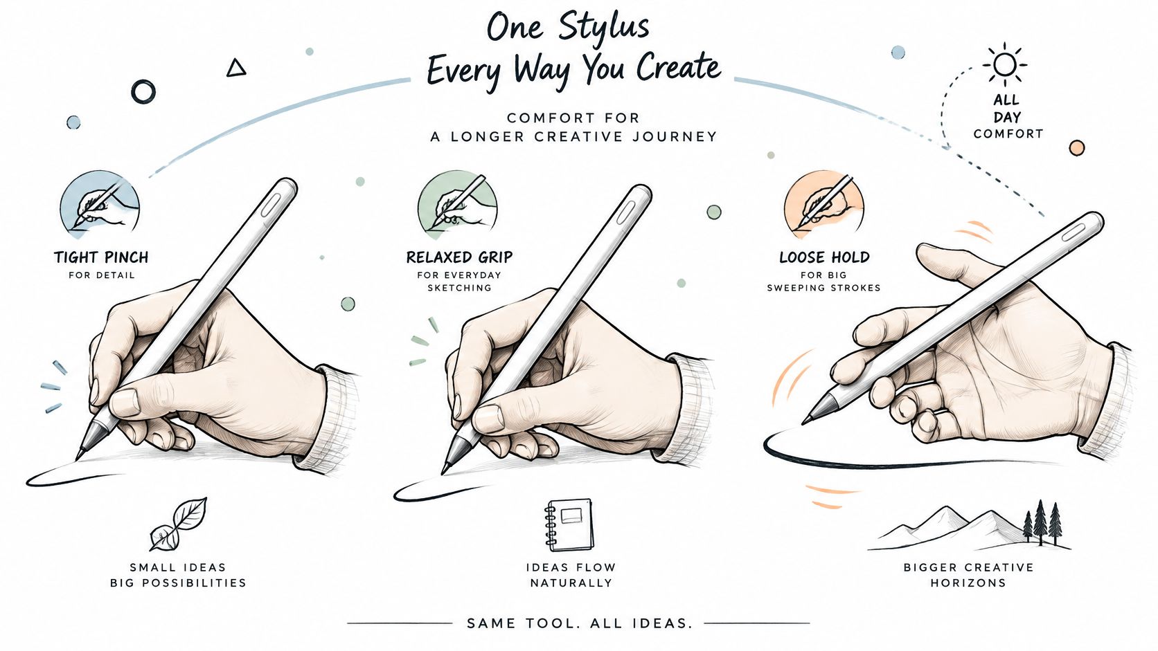
| Grip style | Barrel that suits it | Trade-off |
|---|---|---|
| Tight pinch close to the tip | Thin barrel for precise control | Fatigue builds over long sessions |
| Relaxed grip further up the barrel | Thicker barrel that spreads the load | Can feel bulky for small detail |
| Loose hold for big gestures | Medium barrel with balanced weight | A tip-heavy pen drifts on slow strokes |
Weight distribution does more than diameter. A balanced pen sits steady through a slow, deliberate stroke, while a tip-heavy one keeps pulling forward and forces you to brake against it. That shows up as wobble in long curves and as tension in the forearm after an hour.
Which finger drives the pen matters too. Research on stylus ergonomics found that thumb-based input produced significantly more unintended movement than index-finger input, and that grip style and finger choice alter both comfort and the force applied to the pen, as detailed in this University of Glasgow ergonomics study. A technically excellent pen won't fix a hold that fights it.
Before you blame the pen for a sore hand, rule out the setup. Tablet angle, screen friction and a bent wrist cause more discomfort than barrel shape in most long sessions.
Three setup changes for long sessions
- Raise the tablet angle so the screen sits closer to your eyeline and your neck isn't doing the work your hand should.
- Rest the forearm on the desk or a support rather than holding it hovering, which loads the shoulder within minutes.
- Break every 30 to 45 minutes with a short stretch of the fingers and wrist, before the ache starts rather than after.
Matching Your Stylus to Your Artist Type
The same feature can be essential for one sketching style and irrelevant for another. A shortcut button is a workflow upgrade for a digital painter and dead weight for someone doing loose gesture studies. Match the pen to the work you make.
| Sketching style | Must-have features | Nice-to-have features | Trade-off to watch |
|---|---|---|---|
| Line art and inking | Fine tip, low trailing latency, palm rejection | Shortcut buttons | A fine tip can feel slippery on smooth glass |
| Shading and tonal work | Smooth pressure curve, tilt support | Matte or textured tip | Tilt needs app support to show its effect |
| Loose sketching and ideation | Comfortable barrel, palm rejection | Magnetic attachment | Heavier pens tire the hand faster |
| Note-taking with sketches | Low latency, fast charging or magnetic charge | Pressure for emphasis strokes | Light pens may feel less stable |
| Digital painting | Pressure curve, tilt, comfortable barrel | Gesture or shortcut controls | Premium features raise the cost |
Line artists should rank trailing latency and tip fineness first, because an inked contour is where a lagging stroke is most visible. Shading work inverts that priority: a smooth pressure curve and working tilt will do more for your tonal range than any reduction in latency, since slow marks hide lag and reveal a coarse curve.
Note-takers get the most from charging method and consistency. A pen that's always attached and always charged removes the small friction that stops people writing by hand on a tablet at all.
Quick filter: rank your top two features before you open a single product page. Two is enough to eliminate most of the range.
If some of this sketching work ends up in a portfolio, browse illustrator website examples to see how other artists present line work and process shots side by side.
Budget follows the same logic. Spend on the features your style leans on: a fine tip and dependable palm rejection for inking, or a smooth curve and tilt support for tonal work. Extras like shortcut controls and gesture zones can wait until the core two are covered.
Confirm Your Match Before You Buy
Start with the two features you ranked. Everything below runs in order, and each step filters out pens that looked good on paper.
- Write down your sketching style and your two must-have features. Keep the list where you can see it while you shop.
- Set a budget ceiling first, then compare only pens that cover both features inside it. Raising the ceiling later for a feature you don't need is the most common way to overspend.
- Run the three-part test in your working app: fast diagonals, tight curves, and a slow shaded fill. Judge whether the ink stays with the tip on all three.
- Check palm rest and the pressure curve in that same app. Rest the whole hand, draw long strokes, and confirm the light-to-heavy change is continuous.
- Check warranty length and return terms before you order, so a pen that fails your test can go back without an argument.
Tinymoose is one option worth measuring against this routine. Every stylus in the range has USB-C fast charging, which keeps a session from starting with a dead pen, and the lineup runs from the Pencil Pro Ultra, our most advanced iPad stylus and the strongest Apple Pencil alternative for digital artists, to the Pencil Pro Sketch, tuned with a finer nib response for detailed line work. Treat it as a candidate to test, not a guaranteed result, and run the same checks you'd run on any other pen.
The right stylus is the one that matches your style, your iPad and your hand.
Every Tinymoose stylus is built for the way you use a pen: sketching, shading, annotating and taking notes without babysitting a battery. Whether you're chasing fine linework with the Pencil Pro Sketch or want the full feature set of the Pencil Pro Ultra, USB-C fast charging on every model means less downtime between sessions. Take your two must-have features and visit Tinymoose to compare the range against them before you decide.
Share:
Screen Protector for Apple Pencil: A 2026 Buyer's Guide
Screen Protector for Apple Pencil: Which Type to Choose